The rumors of 2D’s death were greatly exaggerated!
Remember when everyone thought radio was dead the moment TV showed up? Or when people said books would vanish because of eBooks? Yeah… history has a funny way of proving us wrong. The same “death sentence” has been written for 2D illustration in the last few years. With the rise of 3D graphics, AR filters, and even AI-generated art, people were quick to declare, “Flat art is over!”
But not only is 2D illustration alive and well, it’s actually thriving, especially in the world of mobile-first design. In fact, the apps you check daily, like Duolingo’s owl, Headspace’s cartoons, or Slack’s onboarding screens, are powered by simple, clever, and emotional 2D visuals.
So why did people think 2D was “dead” in the first place? There are two reasons:
Tech hype cycles — Every few years, something shinier shows up (3D, AR/VR, AI) and steals the spotlight.
Design snobbery — Many believed 2D was “too simple” or “basic,” forgetting that simple often beats complex, especially on a 6-inch screen.
So, why is 2D thriving in mobile-first design? Because mobile users crave speed, clarity, and personality. And that’s exactly what 2D delivers.
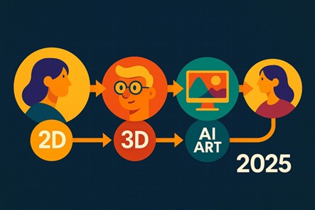
In this blog, we will be discussing what mobile design really means in 2025. Why 2D illustration is making a comeback, along with what the biggest 2D design trends of 2025 are, and finally, how you can nail it with the help of a professional 2D illustration service .
Buckle up, because by the end, you’ll never look at “flat art” the same way again.
Honestly, nobody sits down at a desktop anymore just to casually scroll Instagram or order a pizza. Your phone is your world now. It’s your calendar, your entertainment, your shopping mall, and sometimes your therapist. That shift is exactly why mobile-first design is the backbone of modern digital experiences.
So, what is it really? In simple words, mobile-first design means creating websites, apps, and interfaces for smartphones first, then scaling them up to tablets and desktops. It flips the old-school approach of “design for big screens and cram it onto small ones.” Why? Because today, over 64% of all global web traffic comes from mobile devices. If your design doesn’t work smoothly on a phone, you’ve already lost most of your audience.
And here’s where it gets a little tough. Designing for mobile is like trying to tell a blockbuster story on a Post-it note. You’re fighting:
This is where visuals swoop in like superheroes. Text-heavy designs? Forget it. Complex 3D models? Gorgeous, but they slow things down. What shines on mobile are visuals that are light, adaptable, and instantly readable, aka, 2D illustration.
Think of 2D as the ultimate wingman for mobile-first design. Flat illustrations scale beautifully across different devices, load fast, and communicate emotion quickly than words ever could. It’s why fintech apps use cheerful illustrated characters during onboarding, why Headspace greets you with calming doodles, and why brands like Mailchimp bet their whole identity on flat visuals.
At some point in the last few years, a strange rumor spread throughout the design world: “2D is dead.” Maybe it was the rise of hyper-polished 3D graphics, maybe it was AR and VR showing off their new tricks, or maybe it was the tidal wave of AI art flooding timelines. Whatever the reason, flat illustrations suddenly got treated like the flip phone of the design world, cute, nostalgic, but supposedly obsolete.
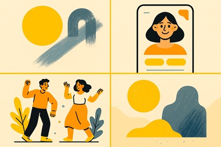
Except… the death was premature. In reality, 2D illustration is still everywhere. Open your phone right now:
Here’s the secret! 2D works because it connects. Its strength isn’t in being flashy, but in being clear and relatable. Unlike over-stylized 3D models that can sometimes feel sterile, 2D feels approachable and human. It’s the equivalent of a handwritten note in a world full of robotic emails.
There’s also the nostalgia factor. For most of us, 2D was our first visual language. You know, those Saturday morning cartoons, comic strips, doodles in the margins of notebooks. That familiarity makes 2D illustration emotionally sticky. It grabs attention and keeps it in ways more “sophisticated” visuals can’t.
And then there’s universality. A smiling 2D character works across cultures and languages without explanation. A flat icon of a shopping cart communicates faster than words ever could. This is exactly why 2D thrives in global apps.
So no, 2D illustration isn’t dead. It never even went on life support. It’s not only alive, but it’s also the design language quietly shaping the way we interact with apps, brands, and content every single day.
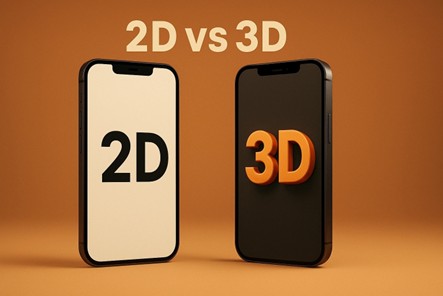
And this isn’t even the best part. We’re only scratching the surface. Because when you line up 2D vs. 3D illustration in the ring, especially for mobile-first design, you’ll see why 2D keeps winning.
Imagine a boxing ring. In the red corner, we have a 2D illustration, the experienced champ! Simple, quick, and universally loved. In the blue corner, we have 3D illustration, the flashy newcomer with depth, lighting, and more polygons than you can count. Both have their strengths, but when the fight moves into the world of mobile-first design, only one walks away with the belt.
Mobile users are impatient. If an app takes more than 3 seconds to load, most people are already gone. 3D files, those highly detailed models with lighting, shading, and textures, are heavyweights. They look stunning on big screens, but on mobile? They can slow things to a crawl.
2D, on the other hand, is feather-light. SVG illustrations and flat graphics load in an instant, keeping the experience smooth and frustration-free.
3D shines on high-resolution desktops, but shrink those assets down to a 6-inch screen, and you risk turning a gorgeous model into an unrecognizable spot. 2D illustration scales beautifully. A simple flat character or icon looks just as clear and communicative on a smartwatch as it does on a billboard.
2D illustrations communicate instantly. A flat envelope icon says “email” without explanation. A 2D symbol with bold outlines is recognizable even in your peripheral vision. However, although 3D can be impressive, it sometimes sacrifices clarity for realism, something mobile users don’t have time for.
This one’s closer. 3D can wow us with realism, but 2D has the advantage of relatability. A hand-drawn smile, a quirky doodle, or a playful flat symbol feels more personal, approachable, and, dare we say, human. That warmth matters when you’re trying to stand out in an endless scroll of digital noise.
Let’s be fair, 3D isn’t useless. For product demos, immersive ads, or AR try-ons, 3D is unmatched. If you’re showcasing the texture of a sneaker or letting users preview furniture in their living room, 3D is the way to go.
But for everyday branding, onboarding flows, error states, and storytelling in apps, 2D illustration is the undisputed champion. It’s fast, adaptable, and engaging without overwhelming users.
Verdict? In the battle of 2D vs. 3D illustration, 3D might win in special arenas, but in the mobile-first design world, 2D is still holding the championship belt.
If 2020s fashion can bring back wide-leg jeans and bucket hats, then design trends can absolutely revive and reinvent 2D illustration. The difference is that, unlike fashion fads that come and go, 2D is evolving in ways that make it stronger, smoother, and more relevant than ever, especially in mobile-first design.
Here’s what’s bubbling up in 2025:
Minimalism isn’t new, but in 2025 it’s getting louder. Expect clean and flat shapes paired with bold, contrasting colors that jump off mobile screens. Think of Google’s playful but simple iconography or fintech apps that use bright greens and blues to signal trust and security. The goal is to create an instant impact without clutter.
Flat doesn’t have to mean sterile. More brands are asking for 2D illustrations that feel handcrafted, with textures, brush-like strokes, or sketchy outlines. This “perfectly imperfect” style adds personality and makes digital spaces feel more human. It’s especially effective for lifestyle apps or creative startups.
Meet the rise of the character 2D design era. Symbols, guides, and illustrated “helpers” are popping up everywhere in apps, whether it’s a cute penguin walking you through your fitness goals or a cheerful character congratulating you for finishing a task. These little buddies are created to build emotional connection and brand loyalty.
Static is out. Animated 2D illustrations that blink, wave, or bounce subtly when you tap them are taking over. Tools like Lottie and Figma make it easy to bring life to even the simplest designs without killing load speed. Imagine an empty cart icon that sighs dramatically, or a calendar app that wiggles with excitement when you finish scheduling.
Stock art is on life support. Brands are investing in 2D illustration services and even 2D art outsourcing to create custom assets that match their unique voice. Why? Because originality sells. Users can smell “generic” from a mile away, and in 2025, nobody wants to look like everyone else.
Trends are nice, but honestly, what really convinces people is proof. And if you think 2D illustration is some outdated artifact, the world’s top brands would beg to differ. In fact, some of the most recognizable digital experiences today are powered by clever and approachable 2D art. Let’s take a look.
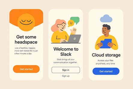
Meditation can feel intimidating for first-timers. Headspace knew this, so instead of clinical photos of people in yoga poses, they leaned on playful 2D characters. These rounded, cheerful figures with calming colors make mindfulness feel fun and friendly rather than “serious” or “exclusive.”
Work tools don’t have to feel… well, like work. Slack, the workplace chat app, understood that endless text could feel dry. By weaving in warm and quirky illustrations, from error screens to onboarding flows, they built an identity that’s both professional and approachable. Their visual language proves that even corporate brands can benefit from 2D’s charm.
Dropbox’s rebrand was a masterclass in modern 2D design. Instead of trying to look like just another file-storage tool, they went bold with expressive sketch-like illustrations. The result was great! Dropbox repositioned itself as a creative collaborator, not just a cloud folder.
Money is stressful. That’s why fintech apps, from banking startups to budgeting tools, are leaning into character 2D design for their mobile experiences. A smiling illustrated piggy bank guiding you through savings goals feels a lot friendlier than a spreadsheet. These illustrations not only simplify complex ideas but also soften topics that usually scare users off.
So far, we’ve talked about emotion, branding, and style, but here’s the thing: 2D illustration isn’t just pretty, it’s practical. Behind the friendly symbols and bold flat shapes, there’s a whole layer of technical power that makes 2D the perfect ally for mobile-first design.
On mobile, speed isn’t negotiable. Every extra second of load time can cost you conversions, downloads, or attention. 2D assets are feather-light compared to 3D models or high-res photography. In fact, SVG (scalable vector graphics) illustrations can load in milliseconds while still looking sharp on any device. That means your app feels snappy, your users stay happy, and your bounce rates don’t skyrocket.
Accessibility is often overlooked in flashy design trends, but it’s a huge factor in user experience. 2D illustrations are more accessible by nature. Simple and flat visuals are easier to distinguish for people with visual impairments or cognitive processing challenges. Plus, 2D icons and characters can be paired flawlessly with alt text, voice-over, or haptic feedback to create inclusive experiences.
A 3D model might look gorgeous on your 27-inch iMac, but shrink it down to an iPhone SE and suddenly it’s a pixelated mess. 2D design scales gracefully across screen sizes. Whether it’s a smartwatch notification or a tablet app, a flat icon or an illustrated character adapts without losing clarity. That makes 2D ideal for responsive, mobile-first ecosystems.
Want your character to wave? Your icon to bounce? Your error screen to sigh dramatically? With tools like Lottie or CSS animations, 2D illustrations can be brought to life without killing performance. Animating 2D elements is far lighter on bandwidth than animating complex 3D objects, which means you get all the delight without the lag.
At this point, you’re probably convinced that 2D illustration isn’t just alive, but it’s running laps around other design trends in the mobile-first world. But here’s a question: “How do you actually do it right?” Because while 2D looks simple, great 2D needs strategy in disguise.
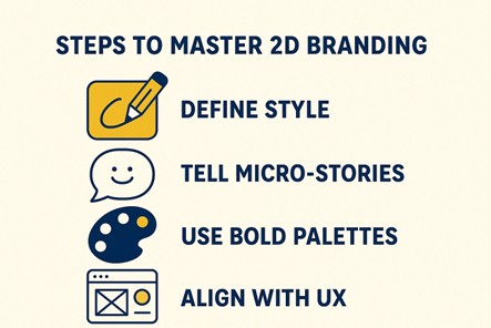
Here are some ways to nail your brand’s 2D game:
Are you going for playful flat shapes, textured sketch vibes, or smooth minimalist icons? Don’t just pick whatever’s trending; choose a style that reflects your brand’s voice. For example, a fitness app might lean into bold and energetic 2D characters, while a meditation app might choose softer, rounded illustrations.
Remember, you’re designing for mobile-first. That means tiny screens and even tinier attention spans. However, the trick is to make each illustration a mini-story. An empty cart icon could look sad and slouchy, while a completed checklist could have a little celebratory character dancing. These micro-stories delight users while guiding them intuitively through the interface.
On small screens, muted shades can disappear into the background. Go for bold and high-contrast color palettes that remain legible in light and dark modes. Duolingo’s green owl doesn’t just pop by accident; it’s engineered for instant recognition.
Your illustrations should direct. Onboarding screens, error messages, and call-to-action prompts are all prime spots for custom 2D art. Done right, these visuals smooth out pain points and keep users moving forward with a smile.
Tech trends love to move fast. One year it’s 3D, the next it’s AR, then suddenly everyone’s obsessed with AI art generators. Blink twice, and there’s a new “must-have” design style being crowned king. But here’s the thing! While all those shiny trends come and go, 2D illustration keeps adapting, and it keeps winning.
Why? Because 2D’s superpower is flexibility. It’s not tied to one platform or one technology. It’s just as comfortable living in a TikTok ad as it is inside a smartwatch app. As new media emerge, 2D will evolve along with them.
We’re already seeing this. Many brands are combining 2D with motion, micro-interactions, and even 3D. Not replacing it, but layering it. The result is the best of both worlds! The clarity and charm of flat design, plus the dynamism of motion or depth. In other words, 2D isn’t going anywhere; it’s just leveling up.
And don’t forget the human factor. In an age where users are skeptical of AI-generated everything, people crave what feels authentic, warm, and approachable. That’s exactly what 2D delivers. Be it a quirky character guiding you through onboarding or a bold icon simplifying a complex process, 2D is the bridge between tech and trust.
So, if you’re wondering whether to bet on 2D for the future, here’s your answer: Absolutely!! Investing in a high-quality, custom 2D art development service or working with an illustration service doesn’t just solve today’s design challenges; it future-proofs your brand for whatever comes next.
Because at the end of the day, 2D isn’t just alive. It’s the secret weapon that makes your brand faster, friendlier, and unforgettable in the mobile-first era, and beyond.
Looking for more information? Call us at +1 (855) 521-5040 for quick support!


Have a project in mind? Reach out to us, and we’ll help turn your ideas into stunning illustrations.
Tell us what you need, and we’ll create a custom illustration just for you. Reach out today and let's get started!

Copyright © 2026 360 Illustration House | All rights reserved. Terms And Conditions | Privacy Policy | Refund Policy
